1. Abstract
As the severity of climate change continues to increase and the consumption of energy in the US remains massive, a critical focus of today’s power industry is establishing sources of renewable energy to replace less climate-friendly alternatives. Focusing on solar energy systems, we aim to address the problem of locating optimal regions throughout the US to build solar farms for cleaner energy production. Our general approach to this problem is to determine the predicted energy output of installing a solar power system at a given coordinate location in the continental US. Leveraging several machine learning techniques to assist our success, we chose to frame this problem as a standard regression task performed by a predictive model. For training and informing the design of our predictive models, we collected, cleaned, and combined location-specific data from several sources on weather, elevation, and solar statistics throughout the continental US. Our modeling approach involves the use of a custom neural network and experimentation with different network layers and nonlinear activation functions. In addition to constructing our custom models, we fit and evaluated a standard linear regression and polynomial regression model from the sklearn library to compare predictive performance across several model architectures (performance assessed via Mean-Squared-Error loss minimization). From our model tuning and comparison procedures, we found that a linear regression model using the ReLU activation function offers the second most accurate solar energy predictions, falling short only to the prebuilt polynomial regression model from sklearn. To visualize and interpret our findings, we developed an interactive map of the continental US, displaying predicted solar energy output (in kWh/kWp \(-\) kilowatt-hour per kilowatt-peak) at a resolution of approximately \(4\) km \(^2\). We intend for our potential solar energy map to stand as a practical tool for guiding future solar power system development and planning.
The entirety of our work is accessible in the following public repository: Solar-Searcher
2. Introduction
2.1 Motivation
As acknowledged above, climate change and global warming continue to rapidly intensify, driving adversity towards billions of people and countless species of wildlife across the planet. In a 2023 report from the World Health Organization, it was conservatively projected that climate change will cause an additional \(250,000\) annual deaths by 2030 (World Health Organization 2023). Along similar and possibly more severe lines, the World Wide Fund for Nature reports a “catastrophic \(73\%\) decline in the average size of monitored wildlife populations” over the past 50 years (World Wildlife Fund 2024). Perhaps the most significant threat posed by climate change and global warming is the irreparable and irreversible alteration of the planet’s biosphere. Some experts even fear that the “point of no return” has already been passed. Yet, despite the daunting effects and implications of the current climate circumstances, it remains crucial to direct worldwide attention, technology, and resources towards establishing climate-conscious societies. It is widely recognized that some of the largest contributors to the current climate crisis are carbon-intensive, non-renewable energy production systems. Consequently, large actors of the global power industry, including governmental bodies and officials throughout many nations, are drawing their attention toward the development of planet-supporting energy solutions. Such solutions involve the replacement of preexisting, harmful energy systems with renewable alternatives. Simply put, establishing renewable and regenerative energy sources is an irrefutably necessary step in combating global warming.
Three of the most common avenues for renewable energy systems are in solar-, hydro-, and wind-powered generators. While these clean-energy sources are proven to be not only highly effective but also regenerative (or supporting of regeneration), they often require a complex set of specific circumstances for construction. Significant renewable energy system limitations include geographical/topological elements and the consistency of weather conditions of a given power production location. To function at peak capacity and comparably to traditional, environmentally abrasive methods, developers aim to install renewable energy systems in regions with the optimal set of conditions. Consequently, the task of identifying these optimal installation locations becomes a primary concern of renewable energy development. As one of the most abundant sources of renewable energy in the continental US, we direct our attention in this study to the development of solar energy systems. Specifically, we intend to address several key concerns of photovoltaic (PV) system implementation including: What factors should solar energy developers take into consideration when initiating installation projects? Based on the relevant factors, which regions are optimal locations for PV system development? At a given location, how can the quality of installing a solar energy system be quantified and compared to other neighboring areas? Driven by these questions, our study offers an approach to solar energy forecasting in the continental US.
2.3 Study Overview
In the sections below, we present our data collection and cleaning protocols; our model designs, neural network architecture, and model comparisons; our solar forecasting results; and an accompanying discussion addressing our progress and potential future work. Additionally, as a preface to the technical content explored in our study, we offer a brief acknowledgement of the societal implications and impact of our work.
3. Values Statement
3.1 Affected Parties, Benefits, and Harms
We view the potential users of our project to be a fairly wide range, including governmental initiatives, commercial enterprises, and possibly individuals looking to invest in small-scale solar farming. Essentially, any party with potential interest in making use of solar energy has the potential to use our project.
Under the assumption that our model will be used to inform solar development, potentially affected parties are the aforementioned end users, who may be benefitted by accurate results informing optimal solar energy development, or harmed if the results are misleading and do not accurately represent the theoretical output. Overall, local communities also have the potential to be impacted, as solar farms do take up a reasonable amount of property, which requires zoning and adequate space (Igini 2023). One other concern is that our application may unfairly harm underrepresented or marginalized groups, as solar panels are expensive to develop, and our model may prioritize more privileged areas. Lastly, it is important to recognize that while our project aims to optimize renewable energy generation, machine learning models require a significant amount of energy to train. While our model specifically only had to undergo training a limited number of times, it is still worth recognizing that, in developing cleaner energy, we do have to make use of existing power.
To summarize, given the increasing global need for sustainable forms of energy, we believe that our model has the potential to be beneficial to the planet overall if it is used to promote development of solar energy. However, we also recognize the potential harms associated with inaccuracies in the model or over-prioritization of certain areas over others.
3.2 Personal Investment
From a personal perspective, we are all invested in this project because we see its potential to improve the efficiency of new solar developments and optimize implementations of renewable energy. We are passionate about increasing the amount of renewable energy used in our ecosystem, and view solar energy as one of the most widely applicable sources. We also believe that leveraging the now widely available data on solar irradiance, weather, and other geological features is a sensible step in the right direction for solar development.
Common criticisms of solar energy include its high initial cost, variability with weather, and the requirement of land and materials to make use of this technology (Igini 2023). Given these difficulties, we find that leveraging data to find patterns of efficiency in solar power generation has the potential to make solar development a more viable source of clean, renewable energy. Using weather data as a feature in our model allows us to factor in weather variability by location, and more closely study the correlations between certain weather features and photovoltaic output. By determining the optimal locations for solar farms, we can also minimize the impacts of high initial costs and the land requirements, as fewer farms will be needed to achieve the same end results.
3.3 Overall Reflection
Based on this reflection, our technology has the potential to make the world a more sustainable place, as solar power has the potential to replace harmful fossil fuels in the energy ecosystem. This outcome also has the potential to make the world a more equitable place, as developing solar energy has the potential to make energy more available in the long term. While there are potential harms associated with predicting photovoltaic output by location, we find that on balance, the potential benefits are strong, and the harms can be minimized through thorough evaluation of our models.
4. Materials and Methods
4.1 Data Collection
The data used in our study was gathered from a collection of publicly available sources from national and international organizations. For solar irradiance and photovoltaic information, we collected data from the National Renewable Energy Laboratory (NREL) (National Renewable Energy Laboratory 2025) and the Global Solar Atlas (GSA) from The World Bank (The World Bank Group, ESMAP, and Solargis 2019). For weather and elevation statistics, we pulled data from the Copernicus Climate Change Service (C3S) (Hersbach et al. 2023) and the Google Maps API. Outlined below are more detailed descriptions of the specific data sources used in our study:
Photovoltaic Output (PVO)
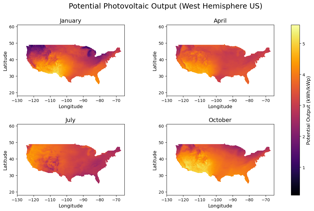
Photovoltaic output (measured in kWh/kWp \(-\) kilowatt-hour per kilowatt-peak) is a quantitative measurement of the amount of producible energy from a solar/PV power system. Specifically, PVO represents the amount of power generated per unit of a given solar energy installation over the long term. Defined in kWh/kWp, PVO describes the energy output in kilowatt-hours of a single PV unit operating at peak performance (according to standard testing conditions) over a designated, long-term period of time. In general, PVO provides a baseline metric for the energy production capacity of a given solar energy system. We collected PVO data from The World Bank’s Global Solar Atlas (The World Bank Group, ESMAP, and Solargis 2019). The PVO dataset we used contains monthly average “practical potential” PVO values from 1999-2018 for a \(0.0083^\circ\)-latitude by \(0.0083^\circ\)-longitude grid (~\(1\) km \(^2\)) of the entire US. Each potential PVO value is calculated using a multi-step modeling process combining satellite imagery, meteorological data, and PV system simulations developed by Solargis (Solargis, n.d.). For each month of the year (12 total data subsets), each row represents the potential PVO value at a given latitude-longitude coordinate location of the US. The figure below provides a visual representation of the PVO dataset used in our study.
Relating to our primary regression objective, we use PVO as the target variable for our predictive models (see sections below for a more detailed discussion). Considering the crucial role that the collected PVO data plays in our modeling approach, the limitations of this dataset should be addressed. Firstly, this dataset contains monthly average values over a ~20-year span, which may disregard or underrepresent historically significant spikes and drops in PVO. Additionally, the values in this dataset are defined in terms of a single PV unit installed at the optimal panel tilt angle. The size of PV units and the optimal panel tilt can vary considerably from installation to installation. Thus, it should be noted that the values in this dataset may be overgeneralizing the projected PV energy yield for certain US regions. Further, the calculated PVO values in this data depend on numerous other relevant solar radiation and meteorological components, which may result in excessive variable correlations in the context of regression models (see sections below for further discussion on this).
Irradiance (GHI)
Solar irradiance (measured in W/m2) quantifies the instantaneous power of sunlight striking a surface. We used Global Horizontal Irradiance (GHI) – the sum of direct beam and diffuse sky radiation on a level plane – as the primary input for photovoltaic (PV) yield models, since PV output scales roughly linearly with incident irradiance (National Renewable Energy Laboratory 2025). Our GHI data from the U.S. Department of Energy’s National Renewable Energy Laboratory (NREL), published as the Physical Solar Model version 3 (PSM v3) from 1998-2016. This dataset contains monthly and annual GHI averages covering 0.038-degree latitude by 0.038-degree longitude (roughly 4 km by 4 km). This data was produced by merging satellite cloud-detection with radiative transfer clear-sky (REST2) and cloudy-sky (FARMS) models. Each row corresponds to one grid cell’s location, and reports its twelve monthly mean GHI values. There are some limitations to consider upon using this dataset. Firstly, values are monthly means, meaning they omit potentially important peaks or lows. Next, panel tilt – finding the optimal angle to capture GHI – is not captured nor discussed by NREL. Lastly, recent climatic trends are not reflected as this data spans only up until 2016; overall weather patterns and irradiance values may have fluctuated since then.
Weather
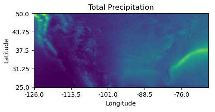
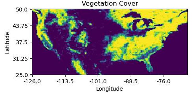
We theorized that the climate of a given area may have a substantial impact on the PVO, as factors like cloud coverage and precipitation would influence the amount of sun available to solar farms. We sourced data from ERA5, the fifth iteration of climate reanalysis data from the European Centre for Medium-Range Weather Forecasts (ECMWF), which combines observations with model data to create a physically accurate and consistent climate dataset (Hersbach et al. 2023). We pulled monthly data from 1999 to 2018 for features cvh (high vegetation cover as a fraction of the latitude-longitude grid), sd (snow depth in m of water), msl (sea level pressure in Pa), tcc (cloud cover as a fraction of the latitude-longitude grid), t2m (2 meter temperature K), u100 (100 meter latitudinal wind component in m/s), v100 (100 meter longitudinal wind component m/s), sf (snowfall in m of water), and tp (total precipitation in m of water). We collected this data for latitude and longitude values in the United States in 0.25-degree increments and took the mean over all months and years. We made heatmaps for vegetation cover and total precipitation to observe how these variables changed with latitude and longitude, which are shown in Figures 3 and 4.
Because this dataset is from a reputable source and is fairly comprehensive, we can trust that our data is reliable. However, it is not without its limitations, particularly because the changes in latitude and longitude are quite coarse with each latitude-longitude pair corresponding to a 17.25x17.25-mile grid. While we were able to achieve finer measurements for our other data sources, we needed to make them more coarse in order to be consistent with this data (see Combining the Data). The climate variables we selected were chosen based on what we thought would have the largest impact on PVO, but our decisions were not backed by any quantitative evidence. Should we seek to make a more thorough model, we likely would want to select more climate features (many of which are provided by ERA5) and determine through quantitative analysis (like a correlation plot) which features would be most effective.
Elevation
Lastly, in our data planning, we theorized that elevation may be correlated with photovoltaic output on the assumption that higher elevation would have more potential to capture the sun’s energy. Given the resolution challenges we were having with our other datasets and the difficulty of finding matching data for elevation, we elected to use the Google Maps Elevation API to retrieve elevation data. With this approach, we can simply make API requests for latitude-longitude pairs after all of the other data has been combined. The API accepts latitude and longitude, and returns the elevation of that location, as well as the resolution of the measurement, in meters (Google Developers 2024). The measurement is relative to sea level, so elevation values can be positive or negative. Google acquired this data using NASA’s shuttle radar program (Google Developers 2024)
The main limitation affecting this dataset is the variable resolution of the measurements. Areas with higher resolution may more accurately capture terrain features such as small hills or cliffs, while areas with lower resolution may be slightly misrepresented or smoothed over. As a result, if our model finds that elevation is highly correlated with photovoltaic output, the resolution could be a source of bias in our results. A more practical limitation is the rate limits: we can only make 512 elevation requests at a time, and only a certain number of requests per day. Luckily, this was only a minor issue for our data collection, simply requiring us to write a batch request function to perform 512 requests at a time until we had the complete dataset.
The figure below shows the correlation between elevation and photovoltaic output in our final dataset, on a small representative sample.
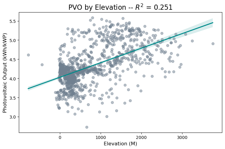
As the figure shows, there is some positive correlation between elevation and photovoltaic output, but it is a noisy relationship, and much of the elevation data is clustered in the zero to five hundred meter range. As a result, elevation was not the most strongly correlated feature in our dataset, but the outlying areas of high elevation showed strong photovoltaic output.
4.2 Dataset Compilation & Construction
With all of these data sources in place, we began our process of combining the datasets into a single .csv file by reading our .tif image files. We wrote conversion functions which would read the data from the .tif files, construct a data frame containing the relevant rows and columns, then export that data frame to a .csv. At that point, we had constructed the relevant .csvs, and then needed to deal with the issue of resolution.
Unfortunately, because our irradiance data was subject to a lower resolution than our photovoltaic output data, we were forced to down-sample the resolution to two decimal places. To accomplish this, we simply created a temporary rounded column, then used an inner join on two data frames using that rounded column, before dropping the mismatched columns and renaming the rounded column accordingly. This allowed us to combine our two key solar datasets, and though we did lose resolution, we were able to keep all of the relevant data points. However, merging this dataset with the weather dataset was a more complicated issue. If we used the same down-sampling technique, we would lose a fair number of our data points, due to a mismatch in the latitude and longitude ranges between the solar and weather datasets. Because these datasets were collected separately from different sources, there were different ranges of latitude and longitude, though there was a great deal of overlap since both datasets pertain to the United States, of course. To account for this difficulty, we used a cKDtree, which allows a nearest-neighbor approach to merging the dataset. Essentially, this structure indexes the latitudes and longitudes in the solar dataset, then queries the weather dataset to find the nearest neighboring points, merging values within a certain range. By taking this approach, we were able to maintain over 400000 data points in our final .csv, which is a dataset size that we were very happy to achieve.
The last step after this combination was to simply use the batch request function to query the Google Maps API for the relevant latitudes and longitudes, then export the finalized data frame to a .csv for ease of access between notebooks. With the full dataset in place, we constructed a correlation matrix for our features, which shows the strength and positive or negative value of correlation between each feature. The correlation matrix is shown below.
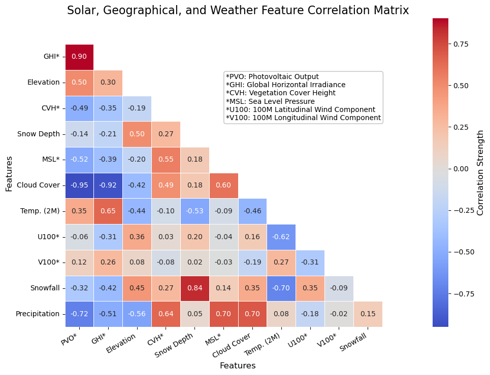
While there are many interesting trends to observe in this correlation matrix, we were mostly concerned with the correlations to photovoltaic output (PVO). The strongest positive correlation was with solar irradiance, which follows our expectations, given that irradiance refers to the strength of the solar beams in a given location. Interestingly, the strongest negative correlation with photovoltaic output was total cloud cover, having even more of an impact than irradiance. This exemplifies one of the primary challenges with solar energy, in that cloud cover blocking the sun can dramatically harm energy output. Other key correlations include elevation, total precipitation, vegetation cover height, and sea level pressure.
4.3 Model Design
We constructed a sequential neural network using PyTorch to try and predict the PVO based on our collected data. We used three linear layers (decreasing by 2-4 neurons with each layer) with a non-linear activation function between each layer. We experimented with a model where we used ReLU functions and one where we used sigmoid activation functions. We evaluated the loss at each epoch and used the stochastic gradient descent optimizer with a learning rate of 0.01. We determined through trial and error that stochastic gradient descent was a more effective optimizer for this problem than Adam and that a learning rate of 0.01 was sufficient to accurately train the model without overfitting. The code for our LinearModel class is shown below. For the models that we used the sigmoid activation function, we replaced all ReLU() calls with a Sigmoid() call.
    class LinearModel(nn.Module):

        def __init__(self, all_feats = False): # "all_feats" arg. passed from above

            # Initialize nn.Module object
            super().__init__()

            # Matrix alignment depending on if all features are used
            if all_feats:
                init_feats = 13
            else:
                init_feats = 12

            # Basic linear model pipeline
            self.pipeline = nn.Sequential(
                nn.Linear(init_feats, 10),
                ReLU(),
                nn.Linear(10, 6),
                ReLU(),
                nn.Linear(6,2),
                ReLU(),
                nn.Linear(2,1)
            )
4.4 Model Training & Evaluation
Before feeding our data to the neural network, we rescaled it using a standard scaling and separated the PVO column into a separate target column. Using SciKit-Learn’s train_test_split() function, we divided the data into a training and testing dataset where 30% of the data was reserved for testing. We batched each dataset using the torch dataloader torch.utils.data.DataLoader() into batches of size 32.
In our preliminary data analysis, we found that irradiance had a strong correlation with PVO. To determine how impactful this would be on the accuracy of our model, we trained models both with and without the irradiance feature and compared their testing losses. The init_feats parameter in our model architecture accounts for this, allowing the model to accept a dataset that may or may not contain the irradiance feature. We thus trained four models: Irradiance included with ReLU activation, Irradiance included with sigmoid activation, Irradiance excluded with ReLU activation, Irradiance excluded with sigmoid activation. We trained each for 100 epochs on the GPUs provided by the Middlebury College Physics Department research computers. The entire code for our model can be found here.
To compare our approach to existing models, we trained a linear regression model and polynomial regression model from SciKit-Learn on our data as well. We evaluated the testing loss using mean squared error, allowing us to directly compare the sklearn models to our own. We compare each of these approaches in the results section.
5. Results
5.1 Model Performance Comparison
Using a Mean Squared Error loss function, we tracked the progress of each of our models and then used the testing loss after the final epoch to evaluate how well our model performed when predicting PVO. We show the loss plots for our four models below.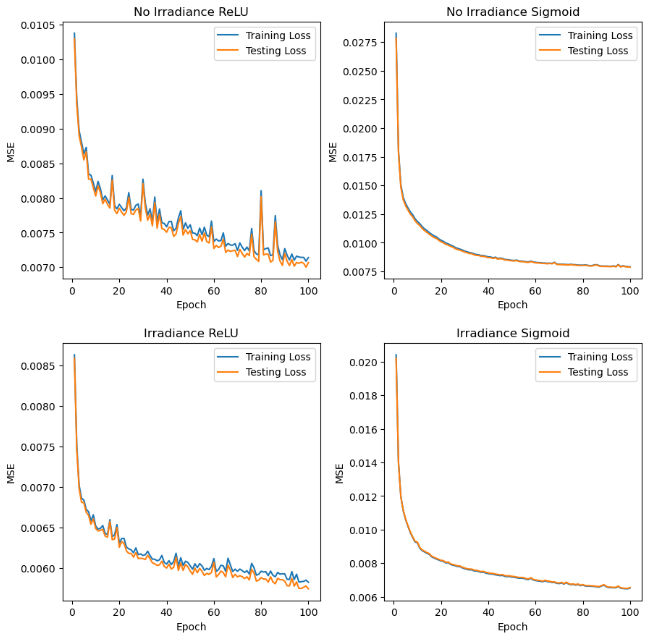
Based on these plots, it appears that the sigmoid models had a much smoother improvement in loss, but ultimately converged to a slightly higher loss value than the ReLU models. We observe the best testing loss with the Irradiance ReLU model with a MSE of \(0.0058\) and the worst testing loss with the No Irradiance Sigmoid model with a MSE of \(0.0079\). The table below shows the testing loss for each model.
| Model | MSE |
|---|---|
| Irradiance ReLU | \(0.0058\) |
| Irradiance Sigmoid | \(0.0065\) |
| No Irradiance ReLU | \(0.0071\) |
| No Irradiance Sigmoid | \(0.0079\) |
sklearn Linear Model |
\(0.0104\) |
sklearn Third Order Polynomial Model |
\(0.0050\) |
Each of our neural network models outperformed the standard SKlearn linear model, meaning the increase in parameters due to deep learning allowed for an improvement in our predictive abilities. However, our best model still underperformed the SKlearn polynomial regression model, meaning there is room for improvement in our deep learning models. We could potentially achieve this by training our models for more epochs, adjusting the parameters in each layer of our model, or implementing a non-linear architecture such as a convolutional neural network to better train on the data. Despite the varying efficacy of these models, all are able to achieve very low loss values relative to the actual PVO values.
5.2 Solar Power Forecasting Map
Utilizing the Irradiance ReLU model, we created a map that comprehensively showcases our end results. The map visualizes predicted photovoltaic (PV) output across the United States, displaying both actual and predicted values for various locations. The interactive visualization uses color intensity to represent the predicted solar energy production potential, allowing for comparison between actual and model-predicted values throughout different geographic regions. The map is shown below.
Figure 7: Interactive Solar Power Forecasting Map
6. Discussion
We set out to answer a simple but high-stakes question: Can we predict the potential solar energy output across the United States? By fusing publicly available irradiance, climate, elevation, and historical PV-output data onto a unified 4-km grid, we trained and benchmarked several regression models, ultimately creating a model architecture that was highly accurate nationwide. The predictions are shown through an interactive map that anyone can easily explore. In short, our project turns scattered open data into an actionable siting tool, closing the gap between technical resource assessments and real-world solar deployment decisions.
In the end, we achieved the core objectives that we set at the start. Our minimum-viable goal was to turn the open data we collected into a working model that reliably predicts photovoltaic output across the U.S. and present those predictions in an easily digestible format. Despite initially exploring wind and hydro, we discovered that collecting, cleaning, and combining the solar-specific data alone was a substantial undertaking, thus we decided to only focus on solar, while still expressing interest in wind and hydro in potential future work (which will be discussed in more detail below).
Compared with earlier regional studies, our models are competitive – even after scaling the problem to the entire continental United States. Munawar & Wang (Munawar and Wang 2020) reported a 4% normalized RMSE (nRMSE) for short-term PV forecasts in Hawai‘i using XGBoost + PCA, and Jebli et al. (Jebli et al. 2021) achieved a 6% nRMSE with an ANN in semi-arid Morocco. By contrast, our best nationwide model – the Irradiance-ReLU network – delivers a 2%* nRMSE and cuts mean-squared error by 44% relative to a plain sklearnlinear regression baseline (0.0058 vs 0.0104). That said, sklearn’s third-order polynomial regressor edges out the neural network (MSE = 0.0050), reminding us that good feature engineering can sometimes outperform added model depth. In short, we match or surpass the accuracy of the regional studies while covering a far larger, more diverse geography, and we do so with models that remain tractable for potential real-world use.
**Normalized RMSE was computed by first converting MSE to RMSE, then normalizing by the average PVO (about 4 kWh/kWp).*
\[\text{nRMSE}=\frac{\sqrt{\text{MSE}}}{\bar{\text{PVO}}} =\frac{\sqrt{0.0058}}{4.0\ \text{kWh/kWp}^{-1}}\approx0.019\;(\text{≈ 2 \%})\]
With additional time, more data, and stronger compute, we would push the project in 3 potential further directions. First, we’d incorporate other renewables – wind and hydro – by sourcing high-resolution wind‐resource and streamflow archives and integrating them into our 4 km grid. This would give much more context for potential renewable energy development, giving a more comprehensive view of which renewable source might be best suited for a certain location. Second, we’d move from a yearly climatology average to more time-specific data, potentially refining our data to utilize daily or hourly measurements. This would allow our models to capture swings in our features, shedding light on potentially crucial intricacies of solar farm developments, such as panel tilt optimization, shading and soil losses, and overall more time-specific weather fluctuations. Third, we’d overlay economic and land-use constraints – site cost, permitting zones, grid capacity – and compute the levelized cost of energy (LCOE) rather than just kWh/kWp. By combining predicted energy yields with spatial cost surfaces and zoning maps, we could pinpoint sites that minimize LCOE or maximize return on investment. On the modeling side, more compute would let us train deeper neural architectures, hypertune our loss functions and activations, and deploy active-learning loops that continually refine forecasts as new utility-scale production data arrive, allowing us to provide more real-time predictions. Together, these enhancements would evolve our prototype into a production-grade platform for optimally siting clean energy systems at a continental scale.
7. Group Contribution Statement
Overall, we all worked closely together on implementing each piece of the source code, on writing each component this blog post (except, of course, for the personal reflection), and on making/presenting our slide show presentation. Below are more detailed descriptions of each group member’s contributions to the project.
7.1 Omar Armbruster
Omar worked on collecting and compiling the weather data used in our dataset. Using the weather data, he was able to create some preliminary heatmaps to visualize the features in different regions of the U.S. He also built the foundation of the neural network (including features like model saving and loading), built the data processing pipeline, and wrote the scripts needed to train the model on the physics department computers remotely. He led the writing of the methods section and the weather data section of this blog post and wrote the loss discussion in the results section.
7.2 Andrew Dean
Andrew collected irradiance data from NREL and developed initial visualizations to explore spatial patterns across the U.S. He then collaborated with Col to merge this irradiance data with Photovoltaic Output (PVO) metrics, calculating annual averages for each feature at every coordinate point. To synthesize the results, Andrew produced an interactive U.S. map using plotly, standardizing the input features and applying Omar’s pre-trained neural network to generate predicted PV values. Each point on the map displays both actual and predicted PV outputs, enabling clear visual comparison. He led the writing of the irradiance and discussion sections of this blog post, and contributed to the results section.
7.3 Col McDermott
Contributing to the source code, Col collected and cleaned the potential photovoltaic output data from the GSA. He then collaborated with Andrew to merge the GHI and PVO data into a single dataset of solar information, collapsing the combined data into the overall annual average (across all \(12\) months) of each feature for every coordinate data point. Additionally, Col worked alongside Andrew and Noah to combine the solar and weather/elevation data into a single curated dataset. Constructing the full dataset involved incorporating a cKDTree from the scipy library to merge datasets with different latitude-longitude resolutions while maintaining a sufficient number of data points and ensuring the absence of any null values. With the full dataset established, Col created some preliminary visualizations to observe potential trends and relationships between various features. Col also assisted with debugging the model design and improving the training scripts. For the project report, Col wrote the abstract and introduction sections (involving research on present-day climate events and some related work in the field) as well as the brief discussion on PVO data collection. In addition to contributing these components, Col worked on organizing and tidying the layout of the full written report.
7.4 Noah Price
Noah began the project working on collecting elevation data for our dataset, which involved establishing a connection to the Google Maps Elevation API using a private key system. He then worked on combining the data from each of our data sources, which involved rescaling the coarseness of the latitude and longitude for some features so that they could be joined with the climate data. With the data in place, he debugged and made improvements to the neural network architecture and infrastructure to optimize the model’s performance and created data visualizations for preliminary data analysis. He led the writing of the values section, combining the data section, and elevation data section of this blog post.
8. Personal Reflection
In this project, I believe that the area in which I learned the most was in working with large datasets. Our dataset came from several different sources, with varying ranges, measurement resolutions, and numbers of rows. I spent the most time working on this project during the data combination phase, where we had to carefully consider the optimal routes to creating one all-encompassing dataset, with features from all of our different data sources. In this process, I also learned a lot about file management and working as a team. With multiple people working on combining the data, we often had multiple csvs floating around, which we did not want to upload to the github repository due to the file size. In the end, I am proud of the dataset we managed to assemble, and the trends we managed to observe.
I also learned a lot about implementation of models and communication. When we first trained our model with our base architecture and parameters, the loss we achieved was significantly worse than loss achieved by a comparable out of the box model from sklearn. However, by adjusting and fine tuning the model, we were able to outperform the linear model from sklearn, and achieve what I think is an excellent level of accuracy. In terms of communication, I thought our presentation came out excellently, communicating both the effort we put into our coding and modeling, as well as the trends and correlations we found in the data. Though I did not work on it directly, I am also impressed and proud of my teammates’ work on the interactive map, as I feel that it is the ultimate culmination of our project, and the coolest end result we achieved.
Though we did have success within the scale that we managed to achieve in this project, we did not meet our initial goals. We had planned to implement the photovoltaic output model, and then either use our findings to inform a cost-benefit analysis model, or apply our existing data pipeline to other forms of renewable energy. I believe that applying our pipeline to other forms of renewable energy was an unattainable goal, because while some of our model architecture and data processing could be effectively transferred or repurposed to fit these subjects, it would require a significant amount of work in data collection and dataset construction. I also believe that hydro would require significantly different model infrastructure, as it is largely based on existing waterfronts, rather than being viable in any particular location.
If we had more time to work on the project, applying our findings to a simple financial model would have been an attainable goal, as well as an interesting application of our results, which would actualize our findings into real world terms. As it stands, our model rests on several notable assumptions, including optimal solar panel alignment, which may make it an unrealistic model of actual solar power dynamics. Despite this, I feel that the patterns we observed and the predictions we achieved are at least interesting, even if they may not be highly viable as a means of informing solar development.
As I move on from this project, and from my college education as a whole, I appreciate the skills I developed in working as a team, and working with complex datasets. I also picked up some git tricks along the way, though I did have problems remembering to press command S before committing my work. Overall, this project lends me newfound confidence in the fields of data science and machine learning that I did not have before. On a personal note, I had been looking exclusively for software development jobs before completing this project, but, as I leave Middlebury and continue to pursue employment, I am now looking at some data-focused roles as well. I have much more confidence working with complex datasets, and performing analytics having completed this project.